Mise-en-Scene
Mise-en-Scene Analysis
Musical

La La Land (2016, dir. Damien Chazelle)
The mise-en-scene in this still is very much of the genre due to the costumes and the location of the film. The costumes are reminiscent of the golden era of Hollywood. It also fits the genre due to the colours of the costume, musicals are well known for their costumes and vibrant colours. The framing of the characters represents the moment where the two main characters (Mia and Sebastian) fall in love, hence why they're dancing in unison. This creates a sense of romance and chemistry which fits the film's theme very well.
Mystery

Mulholland Drive (2002, dir. David Lynch)
The first clue to the viewer that this film is a mystery is in their facial expressions, they both have faces of intrigue. This is also expanded by putting the viewer in the eyes of the main characters by showing their emotions beyond their facial expressions, Lynch does this by creating a very distorted image with their faces and multiplying it; creating a sense of disorientation.
Science Fiction

Blade Runner 2049 (2017, dir. Denis Villenueve)
This still follows many conventions of the genre, like the location, lighting and costumes. The location looks very futuristic from the moment you look at it, the set with the neon lights in the back evokes that. The low-key lighting fits the genre very well and it's reminiscent of other sci-fi films like Alien. The entire still has a slight blue filter over it that gives it a very cold feeling, it also suits the futuristic setting of the film. The costume of Ryan Gosling's character is very sleek and sharp, which is something very common in sci-fi films. This stills creates a sense of enigma towards the setting and its main character, making the viewer question everyone's intention in this world.
Recreation Experiment

Mulholland Drive (2002, dir. David Lynch)

Recreation
Evaluation
As an experiment, it was a good trial to see how difficult it is to recreate an image. The mysterious tone of the original still was successfully recreated, but the lack of attention to details is what made this shoot not be as good as it could have been.
For example, in the original still, the phone is on the other hand and the subject is looking at the opposite side; furthermore, the phone is nowhere near the same phone that is used in the same still. Also, the model in my recreation isn't wearing exactly the same as the subject in the still.
Another issue I have with the image is that I wasn't able to shoot with LED lights and gels to create the read and yellow hue that falls on the subject's face on the original still. I was able to add a slight red filter over my recreation, but it's definitely not the same as the original.
Furthermore, I shot with a relatively high ISO to achieve grain in the image, but this failed and made the image too grainy after adding the red filter, so if I were to re-do this shoot, I would make sure to shoot with the lowest ISO possible and then add the grain in post.
The main thing that works in this photograph is that the tone is maintained from the still to the recreation, and as an experiment, it has already shown me how to improve in the next shoot.
Genre Analysis and Experiment
Film Noir
Film noir is a genre of film that began in the 1930s - 1940s. The name is a French term and it can mean "black film" or film of the night. It is known for it's very distinguishable black and white visuals. It is also very famous for its use of shadows and silhouettes to create a sense of enigma and tension.
They are often shot in cities at night, and the setting of the film is usually in nightclubs, hotels, bars and offices. These elements made the films look very dark because they were shot at night or in dark places.
They often utilise a lot of shadows, like the shadows of window blinds or stair banisters. They also place these shadows on the faces of the actors so their faces are barely visible. This creates a sense of added mystery to the story.
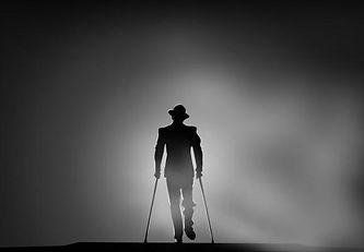
Double Indemnity (1944, dir. Billy Wilder)
In this still from Double Indemnity, the most distinguishable element of the film noir is used: silhouettes. This effect creates a sense of mystery and intrigue that is very effective, since it makes us wonder who the subject in the picture is. Also, it hides where the subject is going towards, adding another layer of intrigue.

Sunset Boulevard (1950, dir. Billy Wilder)
In this still from Sunset Boulevard, there is another major convention of the film noir genre. This is the use of smoke (also, smoking as seen in the previous still from Strangers on a Train). Smoke creates a sense of mystery, and also makes the viewer question the story and its characters.

Strangers on a Train (1951, dir. Alfred Hitchcock)
In this still another of the iconic elements of film noir is seen. These are reflections. They allow the filmmaker to do multiple things, like show something to the viewer that the character's on screen cannot see; therefore raising the tension of the scene.
Research

Strangers on a Train (1951, dir. Alfred Hitchcock)
In this still from Strangers on a Train, we can see the typical props and costumes used in film noir; for example, the cigarette and the suits the men are wearing. These elements are here to give the viewer an idea on the subject's status. They also provide the viewer with an easier way of knowing when the film is set.

Sunset Boulevard (1950, dir. Billy Wilder)
In this still from Sunset Boulevard, we can see another convention of the genre, which is the prevalence of cops and detectives in the narrative. Most films of this genre tended to be mysteries or hybrids of the mystery genre, so the prevalence of cops and detectives was embedded into the genre.

Double Indemnity (1944, dir. Billy Wilder)
In this still from Double Indemnity, the most distinguishable element of film noir is seen, which is the shadows from the blind on the subject. These are arguably the most iconic part of the genre. These create a sense of enigma, since you cannot the subject's face perfectly in some cases, making the viewer wonder the character's intention.
Shooting Plan
For this shoot, I will be shooting with a Canon Rebel/T6i with a 18mm-55mm lens.
I will be carrying out two separate experiments during this shoot, one of which will be outdoors and another one of them will be indoors. The outdoors shoot will be an experiment where I try to re-create the atmosphere of film noir. The indoors shoot will be an experiment on creating the iconic blind effect.
I will be shooting in college, next to the old library and inside the old library.
For the outdoors shoot, I will need to have a newspaper, notebook and pen to be used as props. My model will be wearing a bright blue suit, so I can easily manipulate the shade of the suit later in Photoshop, since I will be editing in black and white. I will also use LED lights to create shadows of the model.
For the indoors shoot, I will need an LED light and my DIY cardboard cutout of blinds.
Photoshoot Images

Evaluation
Overall, I am quite satisfied with these experiments. The outdoors shoot perfectly fits the tone of the genre and creates the atmosphere I was aiming for it to have. The experiments worked very well since they improved my lighting skills and also on how to edit black and white images.
The location worked very well for this shoot since it looks like an alleyway. The biggest issue with it, is that it's too plain. If I were to re-do this shoot, I would try to get a background that looks more like a city, and not so staged.
The model was quite good to work with since he knew exactly the facial expressions I wanted him to do. To make it even better, the model wearing a bright blue suit helped a lot with the editing, since I was able to manipulate the image's colours much accurately.
The lighting for the outdoors/alley shoot was very fun to experiment with. I used an LED light so I could see the shadow in real time, so I knew how the image would look before I shot it. For the indoors shoot, it was a different story, more on that later.
The best part of the shoot is definitely the atmosphere I was able to create, all images very much fit the tone of a film noir. I did this through the use of low-key lighting and some light mise-en-scene elements, like the newspaper and the costume my model was wearing. I also added a slight vignette to create a sense of mystery to the image, which is key in the genre and thus creates atmosphere.
My favourite image is the one above. I quite like the image since it has a sense of enigma, making the viewer wonder the subject's intentions; this is amplified by the low-key lighting and the shadows, also the fact that the subject is looking away. The biggest issue I have with the image is that the newspaper takes away from the illusion, since it looks too modern and also the way the model is holding the newspaper.

My favourite part of this image is how harsh the shadow is and also the position of it. It makes the subject look very mysterious. I also really like how the subject's face is lit, it's a very good gradient created by the light. The biggest issue I have with this image is that the eyes of the subject are lost, which is something I could have fixed by shooting on a lower angle. I tried to fix this by making my subject look up, but it resulted in him looking evil, and not as mysterious. It also made the still look as if it was from a horror film.


Un-edited


My original concept was to shoot this image using a blind cut-out that I created, but upon using it, it failed to create very distinct shadows, so I had to improvise. I carried out the shoot as normal, but once it came to the editing, I warped a series of black rectangles on a separate layer, then I applied a Gaussian blur to those rectangles, and then made the layer be an overlay. This was my final result. I am quite pleased about it, since it turned out to be quite a successful experiment.
Un-edited
Final Shoot
Thriller
Idea Generation
Research
A thriller is a film genre that is constantly shrouded in mystery and suspense. There is always a question that needs answering, and the film makes sure that the audience is constantly trying to answer the question.
Taking the plot of Gone Girl (2014, dir. David Fincher) as an example: “With his wife's disappearance having become the focus of an intense media circus, a man sees the spotlight turned on him when it's suspected that he may not be innocent.” During the entire film, the story makes the audience wonder if the husband is guilty or not, and it’s constantly throwing different clues to the audience. This makes them be intrigued throughout the entire film.
Stylistic Features
-
Many close-ups and extreme close-ups: used to highlight emotions.
-
The antagonist is often hidden, so shots of them are normally silhouettes, shadows or a shot of their back.
-
Use of mirrors: it suggest that the character is reflecting upon themselves and their lives.
-
Angled shots: makes the audience feel uneasy.
-
Setting: Suburbia (Gone Girl, The Girl on the Train), gloomy big cities (Se7en, Panic Room)
-
Props: Weapons, such as guns and knives.
Mise-en-Scene Analysis

The lighting in this still from Gone Girl is very low-key and cool. This is a convention of the thriller genre since it evokes a cold feeling to the viewer. It also distances the character on screen from the people behind her.
This type of lighting is something I would like to use on my stills.
Gone Girl (2014, dir. David Fincher)
The main characters in this film are women, being terrorised by a group of men. The thriller genre tends to have this structure most of the time, which came from the film noir genre and their femme fatales.
I would really like to have my main character be a femme fatale-type character.

Panic Room (2002, dir. David Fincher)

The low-angle in this shot from Se7en makes the subject look powerful and in control of the scene. The depth of field and focus in this shot is extremely effective, making the viewers attention be directed to the face of the subject. This highlights the character's feelings and how his actions are troubling him, instead of simply showing his actions.
I want to try and replicate this use of low-angles and also experiment with depth of field and focus.
Se7en (1995, dir. David Fincher)
Whilst most thriller films tend to have muted cool colours, some decide to go against the genre conventions, like Atomic Blonde. The film is set in the 80s, and it is filled with neon vibrant colours.
In this still, the main character is in a room filled with red light, creating a very intense feeling of danger.
This is something I am going to try and replicate in my photography.

Atomic Blonde (2017, dir. David Leitch)
Mood Board

Mind Map

Synopsis
After three girls are murdered in Kent, journalist Emma Smith is sent back to her hometown to report on the crimes. Haunted by her own tragedies in this town, she finds herself again in the same spot as she was ten years ago. As Emma attempts to discover the truth about these crimes, she finds herself connected to the victims. Emma is forced to unravel the puzzle of her own past to uncover who is behind these horrible crimes.
Audience
My target audience is in the 26-35 age group, skewing to a slight female audience. I'm aiming this audience since most thrillers find themselves with audiences of this age group and gender (e.g. Gone Girl, The Girl on The Train, The Snowman). The BBFC certificate for the film would be 15 due to strong language, violence and threat.

First Shoot
Shooting Plan
I wanted the first location to give off the impression of suburbia, so I needed a house as the location. My flat couldn't work since it's too modern, so I went around my model's house before shooting and found out that this location would work perfectly. Here we also looked at what she could wear and also I tried to look at where to shoot. So my locations to shoot would be in her bedroom and her dinning room, which has a library, from here I will get the book prop.
The shots I want to get are an extreme close-up of the subject's face, which highlights the fear of the situation in her eyes. Another shot I would like to get is a shot of the subject picking up a book, which would work as one of the opening shots, where we see one of the victims living life normally as if nothing was wrong; this would be an over-the-shoulder shot. I would also like to get a shot of my subject walking upstairs, worried about the sound she just heard upstairs; this would be a wide-shot. The final shot I want to get is a shot of the subject lying on the floor, dead, with her hand being the focus of the image, this would be a mid-shot.
For the entirety of the shoot, I want all the images to have a slight blue tint which I will add in the editing process. I also want it to have low-key lighting to create a very gloomy atmosphere. I will use a reflector and natural light to create the lighting in these shots, this is because I want the light to be very soft. This could create issues if I'm shooting in dark areas of the house, but after checking out the location whilst scouting, I don't think it will be possible. Overall, the images should end up with a sleek feel and very tense atmosphere.
Evaluation

The image above is my favourite from the entire shoot, it really feels like a film still and technically is a very strong picture. The composition is probably one of my favourite things about it, given that it follows the rule of thirds and uses it to its advantage, it has the hand as the main subject, but then the attention of the viewer is taken to the background of the image to find clues to whom this hand may belong to. This creates a very intriguing and striking image.
Overall, I'm extremely satisfied with this shoot because it has a very clear set of aesthetics that make the stills look like they are from a thriller film. This was achieved with the lighting, shot types and the location.
My favourite element of this entire shoot is the lighting, I was able to use all the skills I learnt from my experiments on what to do and not to do, and also what I learnt from last year. I wanted to achieve soft low-key lighting with a slight hint of blue. I did this by controlling the shutter speed on my camera, making it really fast until I darkened the image to the point that it looked like it was taken right before dusk. I am really happy with the end result, particularly in the shot above, where the killer has just assassinated his first victim, which works as the catalyst for the rest of the events in the film.
In my shooting plan, I said I wanted a wide-shot of my model walking upstairs, but this turned out to be extremely complicated due to the light in the stairs being too dark, even with the blinds open, the images came out too grainy and one could barely see the model. I could have fixed this by having an LED light with me, but since I wanted to limit myself to using natural lighting and a reflector, I wasn’t able to achieve this shot.
The shot types really give the impression that these film stills are from a thriller, especially the claustrophobic and tense atmosphere these tight shots create. I was able to complete all the shot types I wanted to shoot, and I also experimented with a few shot types. One of these was a tilted shot, but it didn’t make the cut.
The location truly worked for this shoot, particularly since it gives off the impression of suburbia very well. It’s a convention for these films to be set in suburbia, and that had a great impact on the way the entire shoot turned out.
I would have to say the biggest issue I encountered with the shoot was getting the lighting right, especially getting the set of stills to look like they all take place in the same scene. This was done mainly during the editing process, where I edited the pictures very similarly when it came to the colour balance and vibrancy. I also encountered the issue with not using LEDs, but I think I managed to still get a strong set of stills, without using them. For the next shoot, I will make sure to still bring some LED lights with me, and use a diffuser to make the light from them be a lot softer.

My favourite part of this image is the way it is split in half due to the way I lit it. This was done by having my model stand right next to a window, angled in such a way that one side wouldn't be very well lit. This creates a very interesting feeling to the viewer, creating a sense of enigma, making the viewer wonder the intentions of the subject. I tried to emphasise this feeling by making the shot be a close-up of her eyes.
This shot works very well from the standpoint of it being a thriller, I wanted to give off the feeling that the subject is being looked from behind the shoulder from someone taller than her, as if he was about to attack her. To create this, I made sure it was an over-the-shoulder shot, and then I stood on a stool and took the shot. This created the high-angle effect on the shot, which emphasises this feeling of being creeped upon.

Images That Didn't Make The Cut

The intention behind this shot was to have the subject think she heard something upstairs whilst she was going on about her day. The shot didn't work due to it's warm lighting, super noisey look and the face of the model was fully lost with it -- even after using a reflector. This could have been fixed if I had an LED light, but again, I didn't bring one. This is something I must make sure I have with me always.
I wanted to create a shot that was tilted since it was one of the conventions thrillers have. I didn't really like the end result, because of the face of the model and also, it didn't really work within the context of the film. Her facial expression is a bit awkward, and doesn't look as if she is scared. I will definitely try and get another tilted shot in this project.

Second Shoot
Shooting Plan
I want to create a set of images inspired by one of the stills I looked at in my research. The still is question is from Atomic Blonde. I really like the still due to its use of very harsh red lighting, which I thought would be a great contrast with my last set of stills. The scene that I will be shooting will have the protagonist of my film shooting her gun during a fight scene underneath a bridge, full of graffiti.
To find this specific location, I went location scouting around the area nearby my flat, since there are some great graffiti around there. The issue with this place was that it wasn’t allowed to take pictures of the graffiti, since I got told off whilst doing the location scouting. I thought of different places, and whilst walking around college, I encountered a board full of names, that looked quite sinister if you didn’t look at it for a long time. I decided to use this board for my shoot, and where it was placed, worked very well for my shoot already since it gave the place the feeling that it was underground and made it feel more edgy.


Since I will be shooting in a dark place, I will need to have an LED light. I will need to have a red gel, to create the same effect that the Atomic Blonde still has.
For my props, I need a fake gun that looked as realistic as possible. I found out the college has a wide selection of these, so I chose the one that looked the most real and also weighed the most. The weight of the gun would make my model get into character better, and also allow her to hold it in a way that felt realistic.
The types of shots I want to get are a lot more flexible this time, I want to experiment with this setting, and see what comes from it. There are only two shots that I primarily want to achieve, a close-up of the gun, against the background with the red light; and a wide-shot of the subject holding the gun and one can only see her lips in the shot. I really like the idea of this shot, since I tried to play with the idea of the femme fatale character whilst doing research for the previous experiment about film noirs.
Evaluation

The image above is my favourite from the entire shoot, particularly due to the feeling it creates of immediate danger. This feeling is created from the lighting environment I used during the shoot. It is also my favourite since it’s the strongest one out of them all, technically speaking.
Overall, the shoot wasn’t as successful as my previous shoot, but I still did manage to get some stills that I like a lot. The biggest issue I had with the shoot was that the location limited me to what I could try and do, and also the technical aspect of the shots wasn’t as strong. That said, my intention of making my character look like a rebel / femme fatale.
The location was great for one shot, but it wasn’t flexible for me to experiment with different styles of blocking and sets. I think this is due to me doing a location shoot based on just a background, not the entirety of the location. This meant that I was only able to shoot one great picture, and the rest are sort of mediocre copies of that image that is great. I will definitely take this into consideration when selecting the location for my next shoot.
The biggest issue with the photographs in this shoot was the technical aspect of the shots, especially, how the stills weren’t as sharp as the ones in the previous shoot were. This is also why the image above is my favourite from the rest, since it’s the only one where I didn’t have this issue as bad as in the rest. The issue of the shots being blurry began because of the location being quite dark, and I didn’t change the camera settings to make up for this. I didn’t realise whilst shooting how slow the shutter speed was in comparison to the previous shoot, so it made the shots look blurry most of the time.
If I were to re-do this shoot, I would attempt to choose a location with a great background like this one, but also make sure that there is more to experiment with around, and not just the background. Furthermore, I would make sure the shutter speed was going at a speed above 1/80 – 1/100, to make sure it is not as blurry as these ones came out as.

This image works very well in terms of achieving my intention of making the subject look like a rebel. This is created by having the face of my model be cut in half, this adds a sense of mystery to the character. Also, since I removed the eyes from being visible, it makes the character look like a stone-blood killer, since the viewer cannot fully comprehend how the subject feels whilst holding a gun.
In this shot, the original was extremely blurry towards the model's face; I tried to fix it by using a tilt-shift focus effect on Photoshop, making the focus just be on the gun -- which was the sharpest object in the shot.

Images That Didn't Make The Cut

It's very clear why this one made the cut, I found it to be the weakest out of this shoot. Technically, it fails because of how unsharp the image is. Aesthetically, it fails because it doesn't have the same effect of making the subject look as much as a rebel as the other two images above do.
Third Shoot
Shooting Plan
For this shoot, I want to create a very tense and scary atmosphere, similarly to the first shoot of this project. I want to have a tilted shot and also a close-up. This shoot should have very dark low-key lighting with very soft light. I want my model to have a very scared face during the shots, since this will be the scene where the protagonist starts to obsess with the crimes she is investigating and it’s meant to show her demise.
To make sure the same incident as before happens, I will choose a location that allows me to experiment with it. I chose a little room inside the college which works pretty well for what I wanted. The biggest issue with this location is that the door I want to shoot on is of the colour green. I would prefer a different coloured door, but I will try and edit it and change the colour after the shoot.


For the costume, I will ask my model to wear comfortable dark clothes that look like the clothes someone would wear at home.
For the lighting, I will use two LEDs, and also use the lighting in the location to my advantage; since the room is quite dark if the lights are turned off, I can create a very interesting effect by having a room that very well lit up, and then when the subject looks at the other room, it’s extremely dark, creating an interesting contrast.
Evaluation


Un-Edited
The image above is my favourite from this shoot, it feels like a true still from a thriller film and also has a very calculated feel about it that is very aesthetically pleasing to the eye. It was quite hard to edit it for it to end up looking the way it currently is. A few of the things I did were adding a vignette to add a more dramatic effect to the still – I did the same to the second image. I also edited to the colour balance, made it look a bit more cool and purple than the original shots were, by toying around with the colour balance.
Another thing I love from the shot above is the way the light contrast from inside the room to the outside. This was achieved using a blend of both lighting and also editing. During the shoot, I simply turned off the lights outside the room my subject was in, and made sure all the lights were on inside the room. Then I amplified this effect in Photoshop by selecting the outside of the room, and darkening it using the brightness tool.
Overall, I’m quite happy with this short but successful shoot. I managed to pull off the two shots I wanted, including the tilted shot that I really wanted to do from the beginning of the project. Furthermore, all technical aspects are very strong, particularly the lighting. And finally, the lighting is exactly how I wanted it to be.
My favourite thing from the entire shoot has to be the atmosphere these two shots create. They are very tense and sleek, and also look like they are form the same scene due to the colour correction.

Edited
My favourite part of this image is the editing, specially when one can see the unedited version. The colour correction really change the mood of the shot, and make it go from an amateur photo, to a very sleek film still that gives a very uneasy image.
Another thing I quite liked was the facial expression my model had. I told her to look at a very specific point in the room, and she held that throughout the shots. It also works since she looks scared in a very nuanced way, that is very effective.

Un-Edited
Images That Didn't Make The Cut

The biggest issue with this shot is the subject's face, she simply doesn't look as scared as in the other shots. Also, the straight angle instead of the tilted angle doesn't have the same impact.
This shot works very well, but it didn't make the cut because I preferred the other one. This was because the other one was a close-up which really emphasised the fear in the subject's face, whereas this one doesn't do the same because it isn't a close-up. That said, I did really like the feeling of emptiness this version of the shot has.
